Thums Up Unveils Bold New Brand Identity After Two Decades
Brand Marketing
S
Storyboard•16-01-2026, 16:53
Thums Up Unveils Bold New Brand Identity After Two Decades
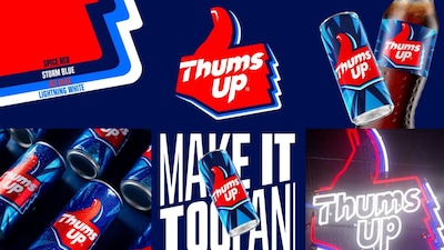
- •Thums Up, India's homegrown cola giant, has launched a new brand identity, marking its first major visual evolution in over two decades.
- •The rebrand reflects a strategic shift, aiming to resonate with a new India characterized by ambition, confidence, and a drive to maximize every moment.
- •The in-house design team at Thums Up collaborated with design agency SUPERULTRARARE for this identity overhaul.
- •The new visual identity features a trio-color palette of spiced red, iced blue, and storm blue, symbolizing strong taste, thunderous refreshment, and an adventurous personality.
- •Sumeli Chatterjee highlights the rebrand as a strategic move to reinforce cultural relevance and unlock future growth, making the brand more dynamic for young India.
Why It Matters: Thums Up has refreshed its brand identity after 20 years to connect with modern Indian youth.
✦
More like this
Loading more articles...